Marconn Dasboard

Platform to facilitate internal information management.

Where

Olot, Spain

When

2021

What

Dashboard

Role

UX Designer, QA Designer

Responsabilities

Paper and digital wireframing, low and high-fidelity prototyping, accounting for accessibility, iterating on designs and primary contact to the client and the development team.

Problem

The current supply pedestal management dashboard lacks user-friendliness and efficient features, hindering our client internal information management processes.

Also the site managers lacked real-time visibility into supply pedestal status and maintenance needs, resulting in delayed response to issues; as well as ser satisfaction with the existing dashboard was low due to usability issues and limited functionality.

Goal

To restructure, redesign and enhance the supply pedestal management dashboard in order to improve internal information management, streamline client database management, billing processes, and site management; and increase user satisfaction by delivering a user-centric dashboard that meets their needs, is easy to use, and enhances their productivity.

Impact

The project's outcomes significantly improved the organisation's operational efficiency, streamlined internal information management, and enhanced user satisfaction, resulting in a more effective and user-friendly dashboard solution that positively transformed their supply pedestal management processes.
Project Highlights
One of the key objectives was to improve billing accuracy and efficiency.

By implementing automated billing processes, data validation mechanisms, and user-friendly interfaces, they increased in billing accuracy and efficiency.

User Research

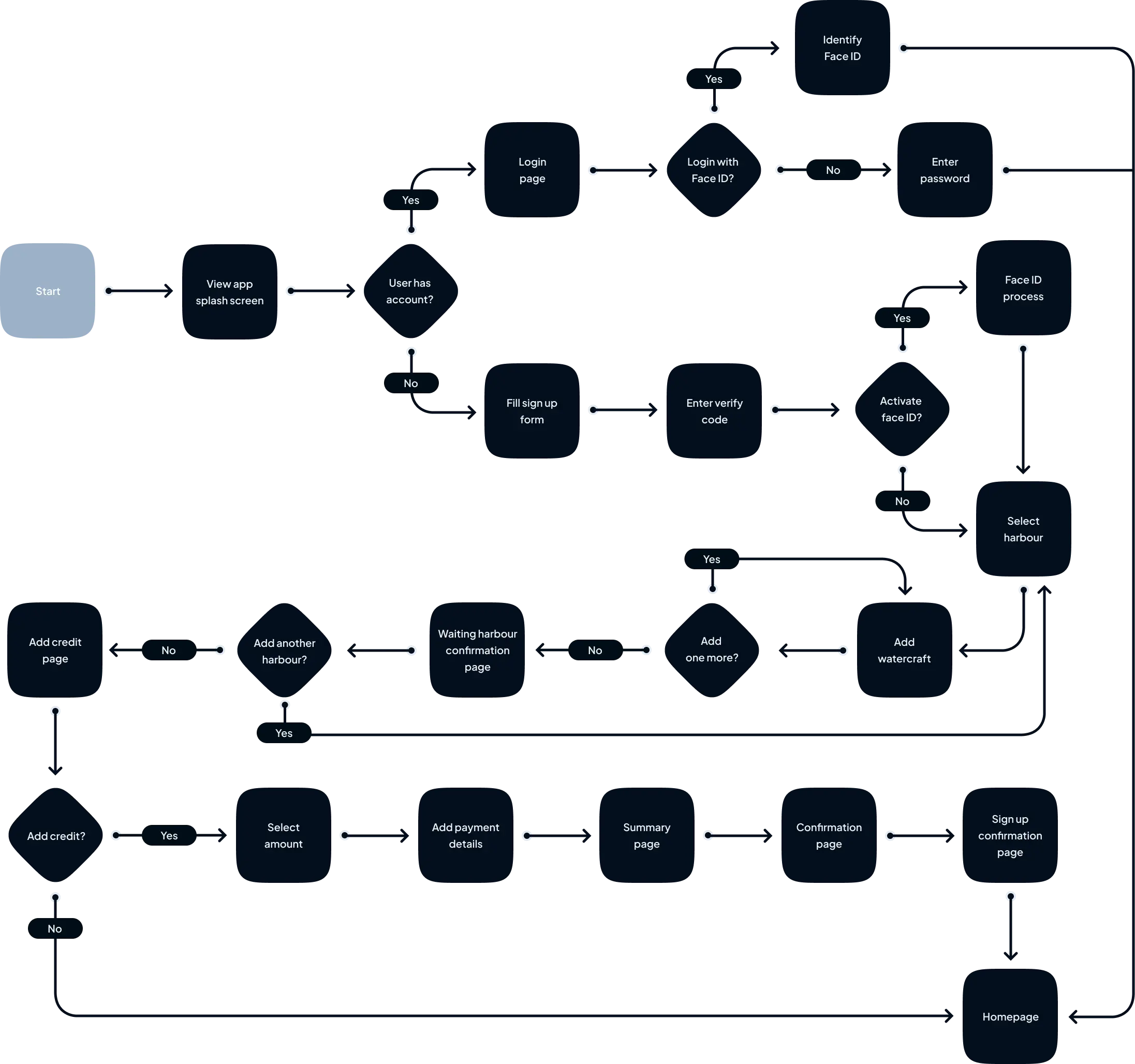
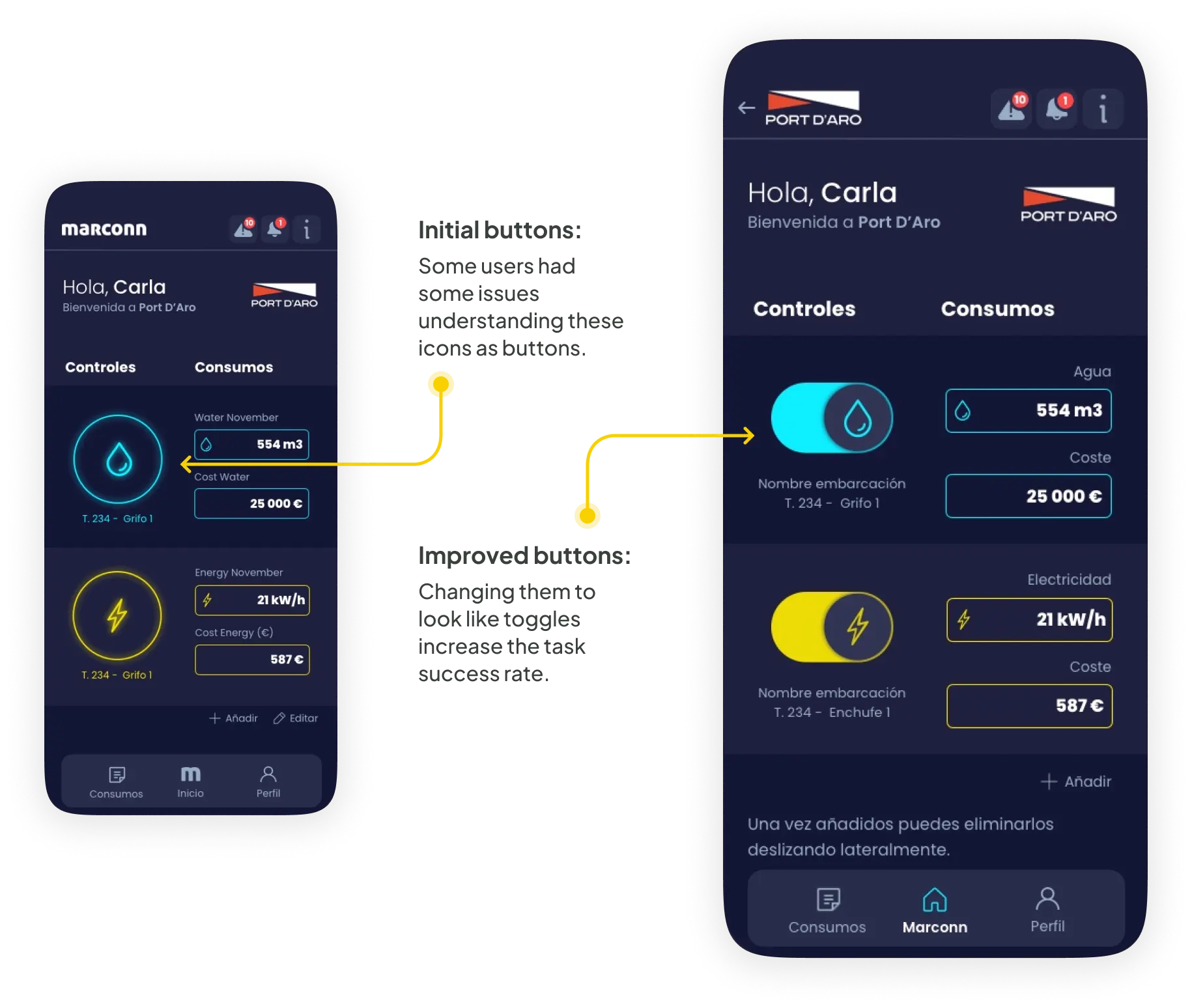
No user research was done for this project but the client provided us with feedback and insight from their real customers, which showed the lack of user independence and the need for a solution.

Thanks to this feedback we were able to not only create but also iterate the functionalities and flows of the app once they were available in the app.
Pain Points

Process

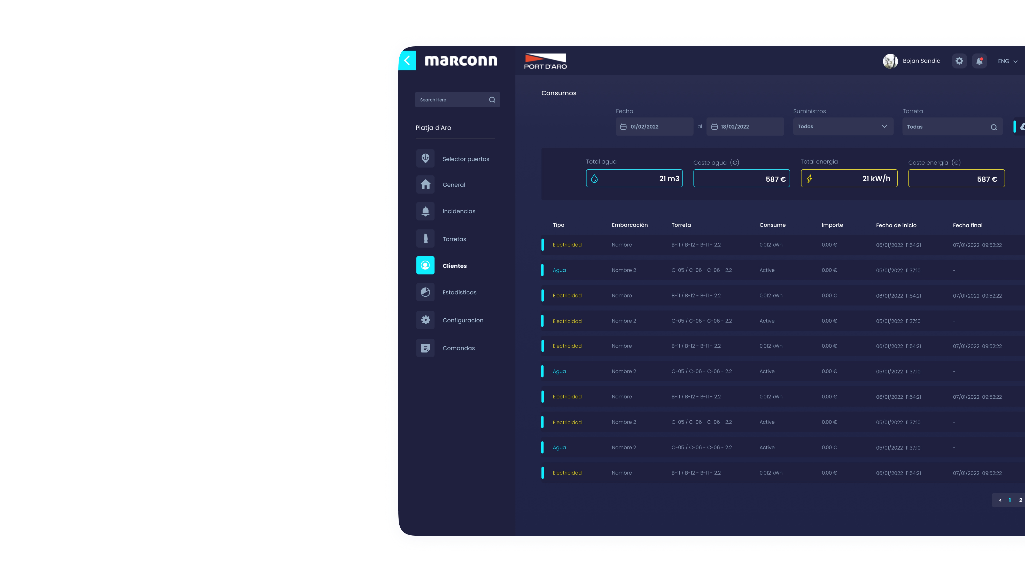
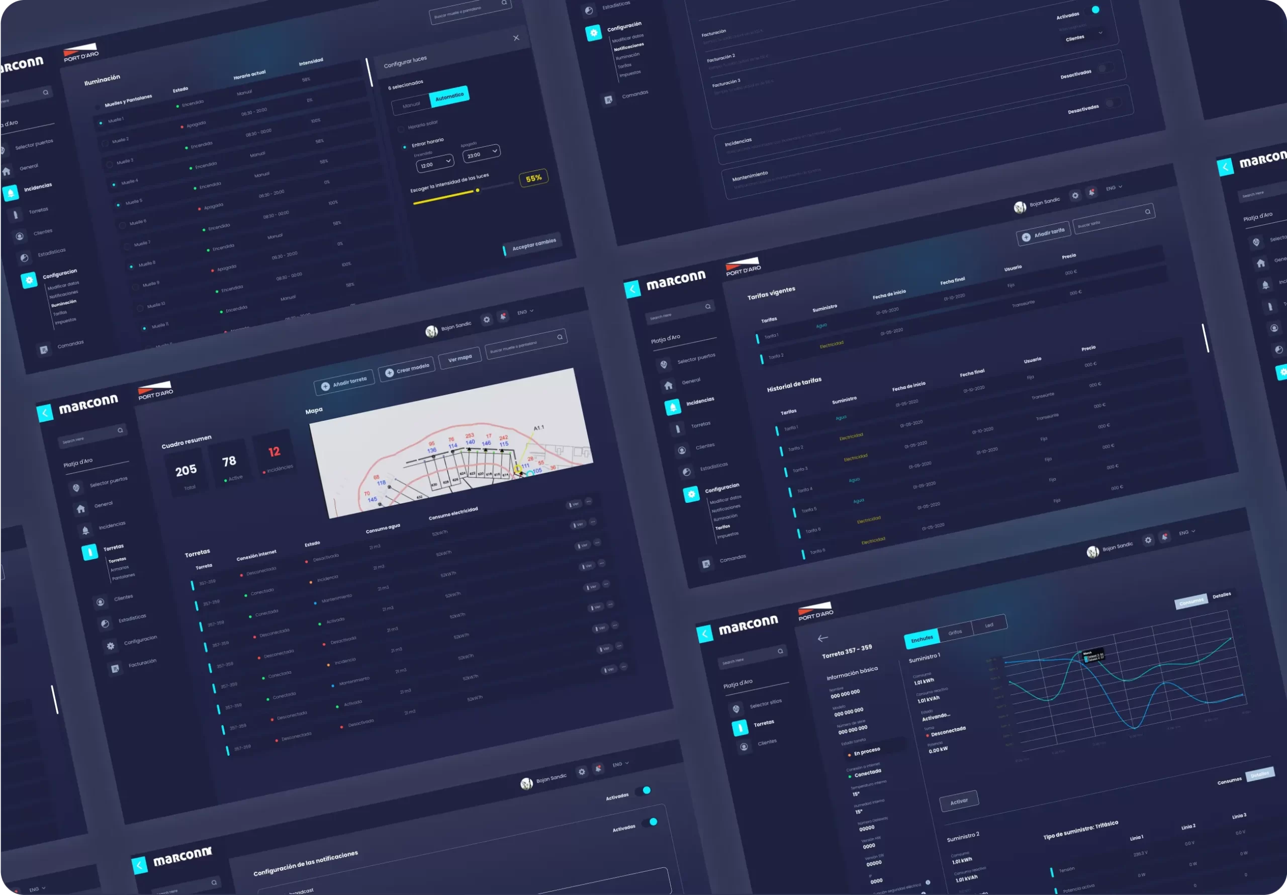
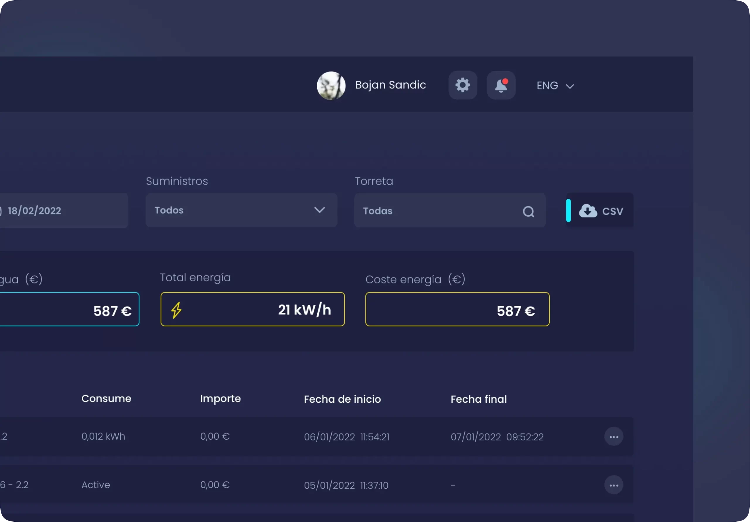
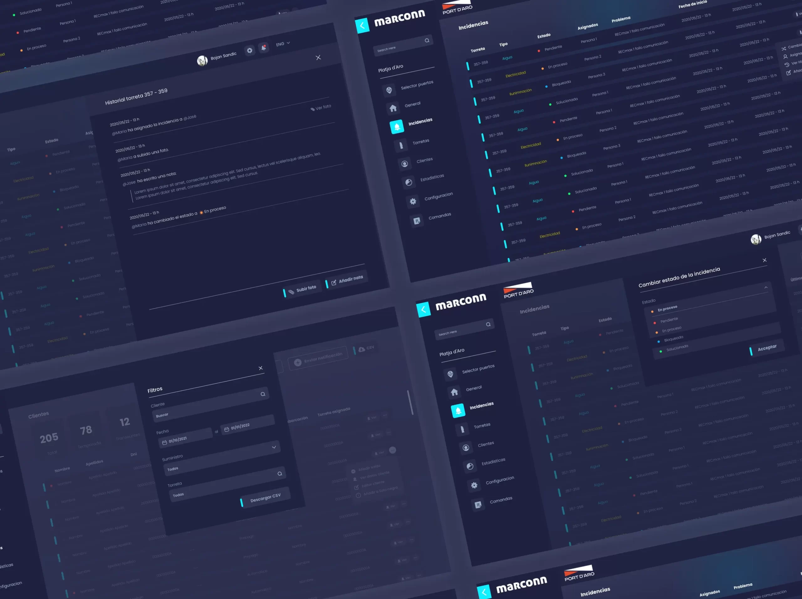
Billing processes are manual, time-consuming, and prone to errors, leading to delays and inaccuracies in invoicing. Our goal was to automate billing procedures within the dashboard to improve accuracy, reduce processing time, and enhance billing transparency.

Information Structure

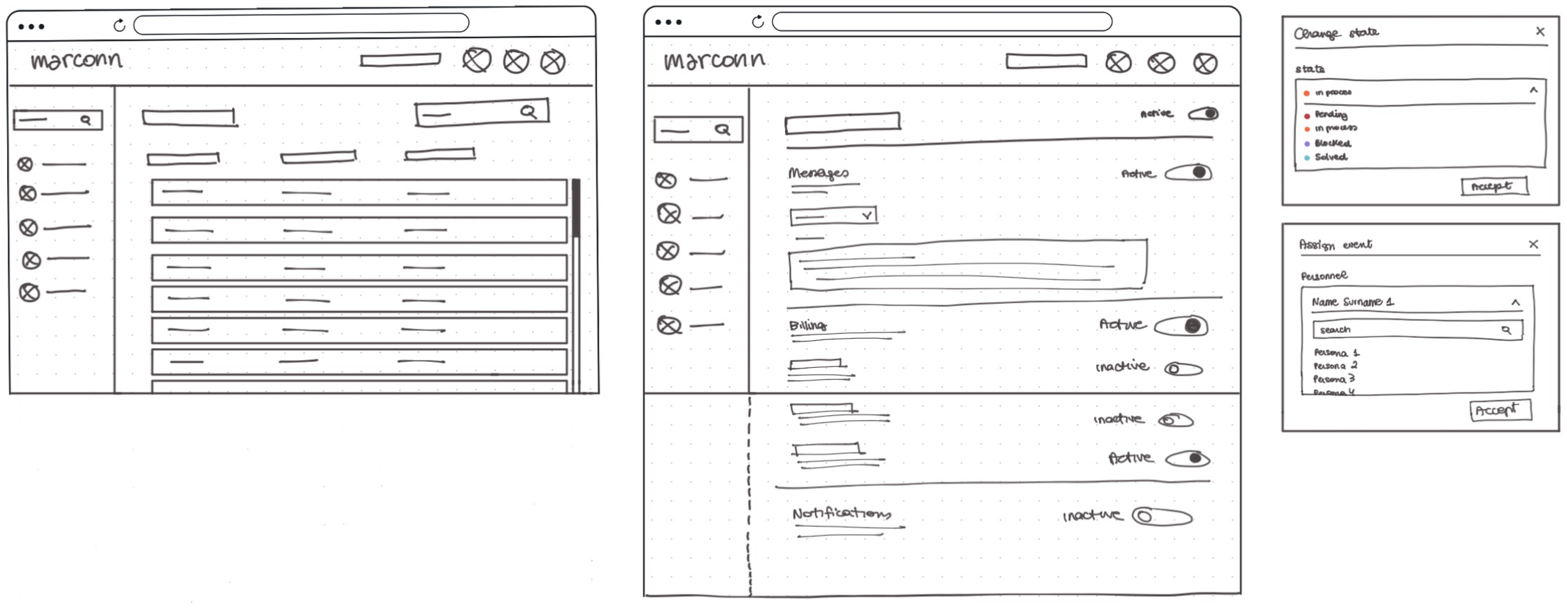
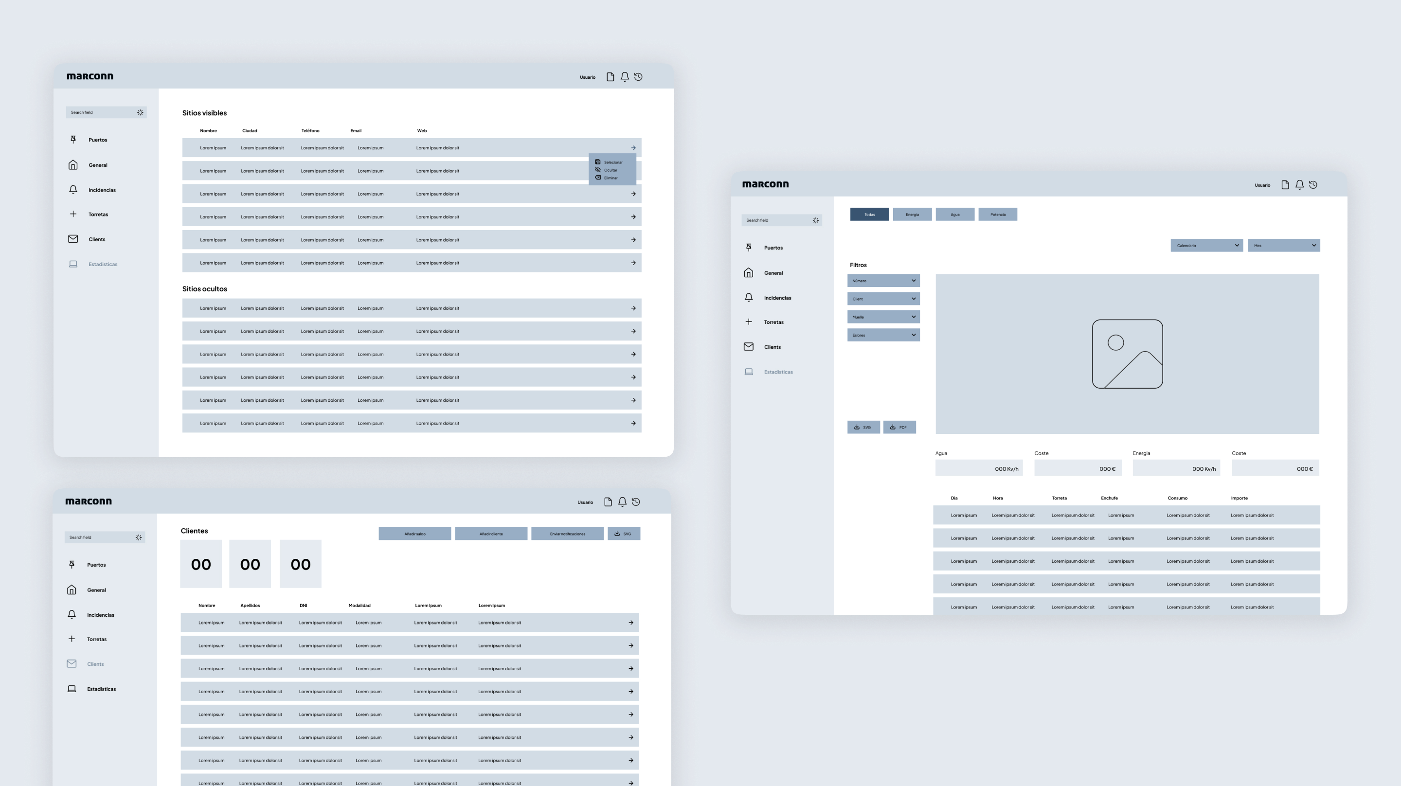
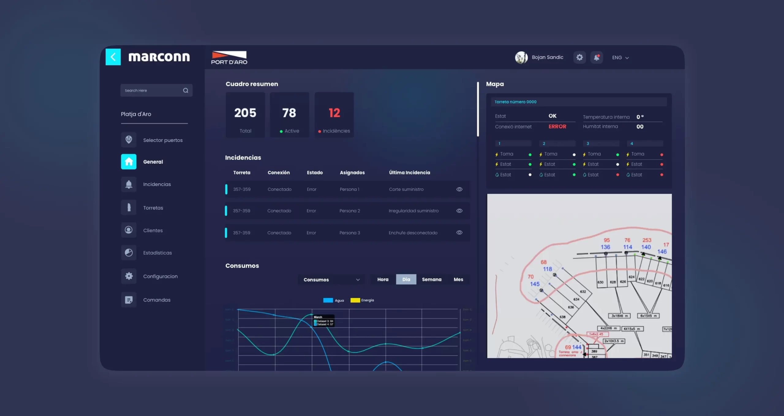
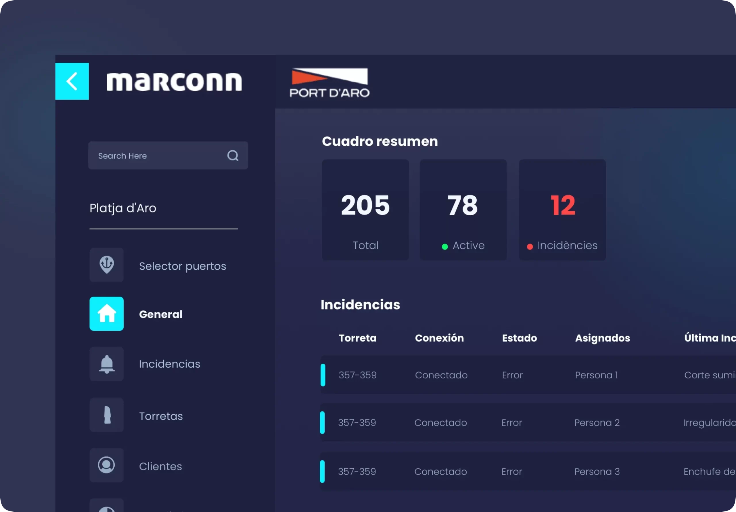
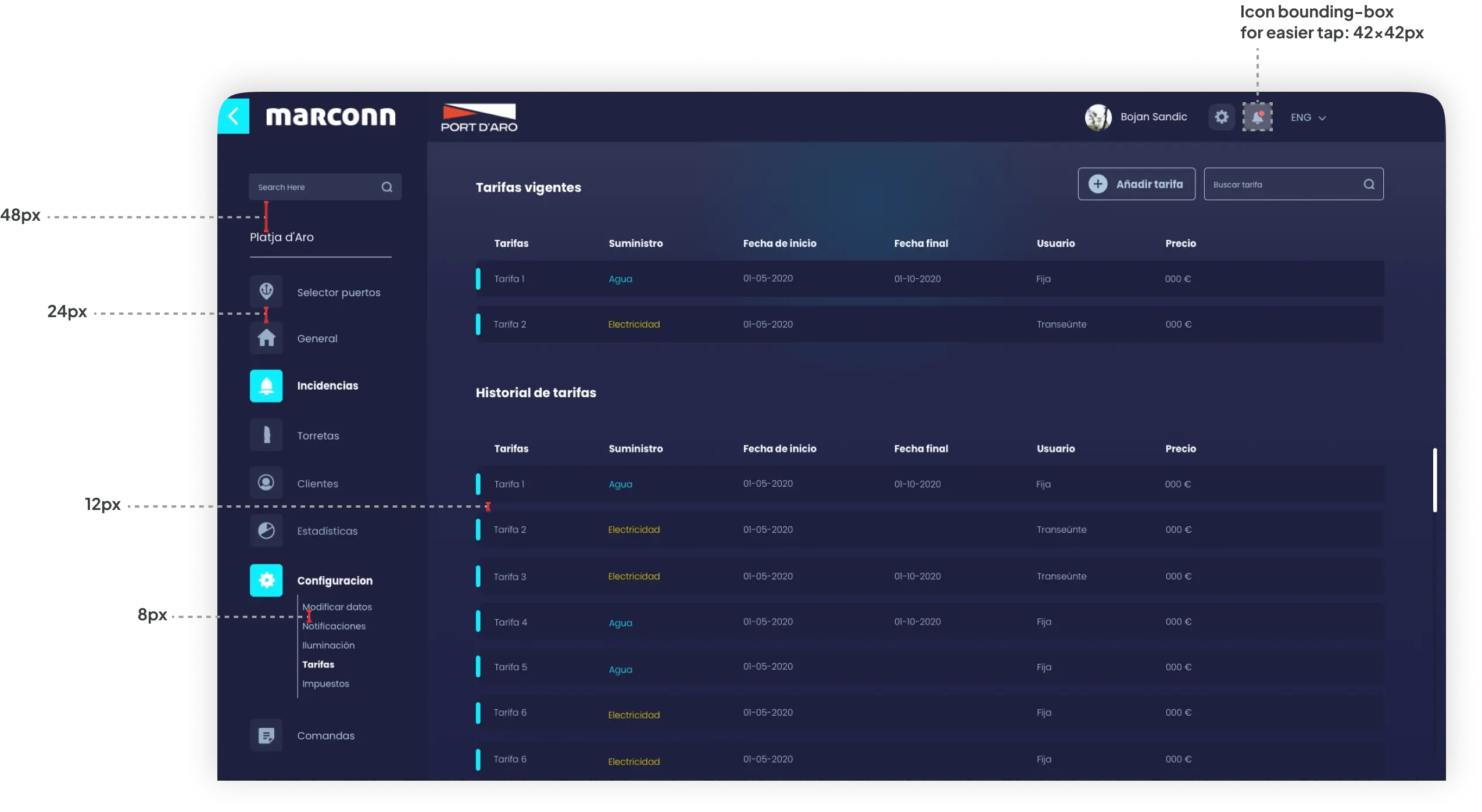
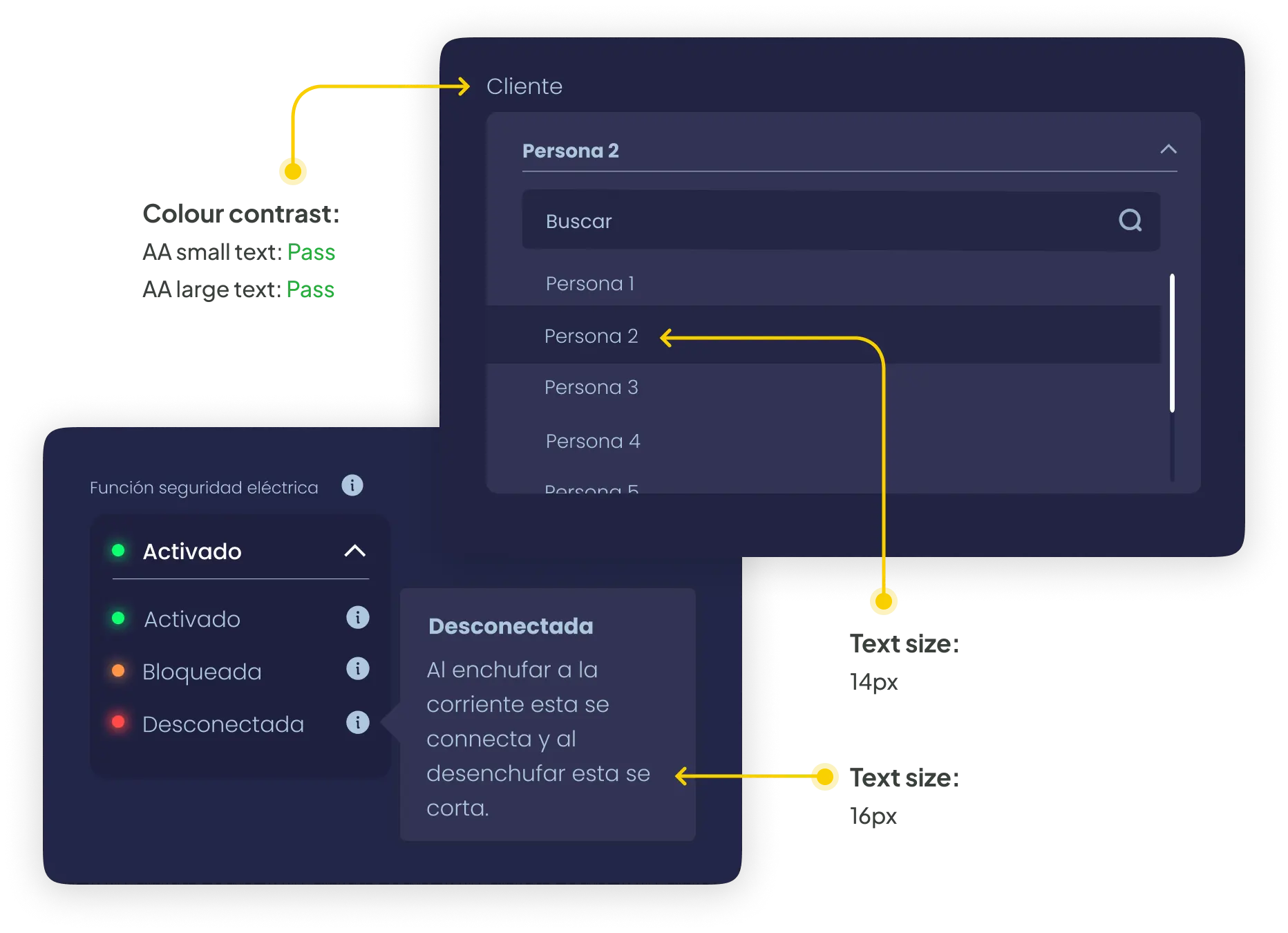
The existing dashboard has a confusing information structure, making it difficult for users to find relevant data and features. The goal was to revise the information architecture to ensure a logical and user-friendly layout, facilitating easy navigation and task completion.

Productivity

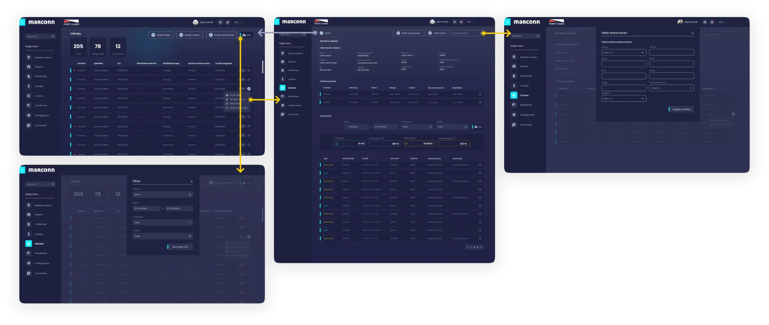
Users currently struggle with data entry and retrieval, leading to errors and inefficiencies in client database management. We created an intuitive user interface that simplifies client data entry and retrieval, reducing errors and saving time.

Flow Diagram

In every successful User Experience design, understanding the target audience is paramount. Personas provide valuable insights into our users' motivations and challenges, guiding us to create a more tailored and inclusive user experience.

Goals

Stay informed about local news and events.
Access news conveniently despite limited internet connectivity.
Find relevant stories and information that impact her community.
User-friendly website with intuitive navigation and clear content organisation.

Frustrations

Lack of coverage her town receives from larger news outlets.
Limited and intermittent internet connectivity, which hampers her ability to access online news and stay updated regularly.
When news content is not optimised for mobile devices or lacks accessibility features, making it challenging for her to consume news on her preferred platform.

About María

☺️
35
🎓
Bachelor's degree in Education
🏙️
La Guajira
María is a dedicated teacher who is passionate about education and community development. She resides in a town that often goes unnoticed by mainstream news outlets. María strongly believes that access to reliable information is crucial for her town's progress and the well-being of its residents. Her goal is to stay informed about local news, events, and developments that directly impact her community. She wants to be able to access relevant news easily and conveniently, despite the limited coverage her town receives.

Problem statement

María Rodríguez, a teacher in an underserved town, lacks access to reliable and relevant local news due to limited coverage, unreliable sources, and poor internet connectivity.

Flow Diagram

To outline all the necessary steps and functionalities, I created different flow diagram of the main tasks the user can do. One of the flows is shown below. Fail state flows were also created, but are not shown due to space constraints.

Onboarding user flow

Paper wireframes

In the initial phase of the project, I created paper wireframes as a low-fidelity prototyping method to quickly iterate and visualise the redesigned dashboard's layout, structure, and key functionalities, allowing to gather early feedback and refine the design direction.

Digital wireframes

Once the paper wireframes were ready, I started creating the low fidelity wireframes of the main flows.

High-fidelity UI design

When the initial flows were complete, I started by creating a few of the main screens of the app.

Colour palette

Accent, primary, secondary, background

Font

Poppins
Regular, Medium, Semi-Bold, Bold, Black
AaBbCcDdEeFfGgHh

39 high–fidelity designs were created

In the final phase of the project, we translated our refined wireframes into high-fidelity mockups, delivering a polished visual representation of the redesigned dashboard that closely resembles the end product, allowing stakeholders to envision the user experience and final design aesthetics.

Alignment and grid

I picked an 8–point grid for the project and set the margins for within groups at 8 and 16, with margins between groups at 24, 32 and 48.

High-fidelity prototype

I connected my high-fidelity designs into a clickable prototype. This will allow me to better present the app to stakeholders and better showcase the features and user flows for development.

Insights from real users

Once the functionalities were ready and tested, real users were able to use them and, from this initial contact, they sent us their comments and queries and we were able to identify areas in the mockups that required further refinement.
One iteration that we considered a priority was to change the appearance of the buttons to open and close the water and electricity supplies, as some users had difficulty identifying them as buttons.
It was also found that first-time users had trouble figuring out all the action that could be be done throughout the application. For this reason, we created a series of animations to be use as in-app tutorials to boost user adoption.

Accessibility check

The app has been evaluated for contrast to match the AA standards of WCAG.

When revising the screens I found that the size of some texts needed to be bigger for them to be accessible. The smaller size found within the app is 14px, and these are used for secondary texts. For more relevant ones the smaller size is 16px.
Project summary
This project successfully redesigned and enhanced the dashboard, addressing critical issues, improving internal information management, automating billing processes, and achieving substantial increases in accuracy and efficiency, ultimately delivering a more user-friendly, productive, and impactful tool.
linkedin facebook pinterest youtube rss twitter instagram facebook-blank rss-blank linkedin-blank pinterest youtube twitter instagram