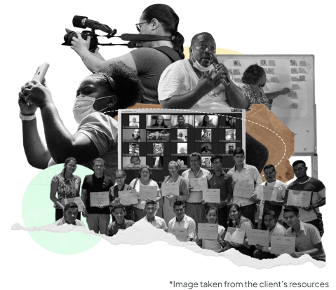
Consonante

Journalism lab that fights informationally marginalised towns in Colombia.

Where

United Kingdom

When

November 2022 - June 2023

Role

UX Designer, QA Designer

Responsabilities

Conducting interviews, paper and digital wireframing, low and high-fidelity prototyping, conducting usability studies, accounting for accessibility and iterating on designs

Problem

The current website fails to meet the needs and expectations of users due to its ineffective functionality, mismatched graphic image, non-functional search field, and inadequate performance score. Additionally, the user flow for newsletter registration requires improvement to enhance user engagement and conversion rates.

Goal

Redesign the website to align with the requirements of the users, establish a visual identity that reflects that of a credible media outlet, ensure the proper functioning of the search feature, significantly improve the website's performance score, and optimise the user flow for seamless newsletter registration, thereby enhancing user satisfaction and achieving higher conversion rates.

Impact

By redesigning the news outlet website with their specific needs in mind, we strive to empower individuals with access to reliable and relevant news. This project not only enhances user experience but also fosters community engagement, facilitates informed decision-making, and contributes to the overall development of these communities. Through our efforts, we aspire to bridge the information divide, amplify voices, and create a positive impact on the lives of those who have long been in the shadows of larger news outlets.
Project Highlights
Throughout the process, I learned, once again, the importance of user-centric design and the impact of seamless user experiences on overall website performance and success.

User Research

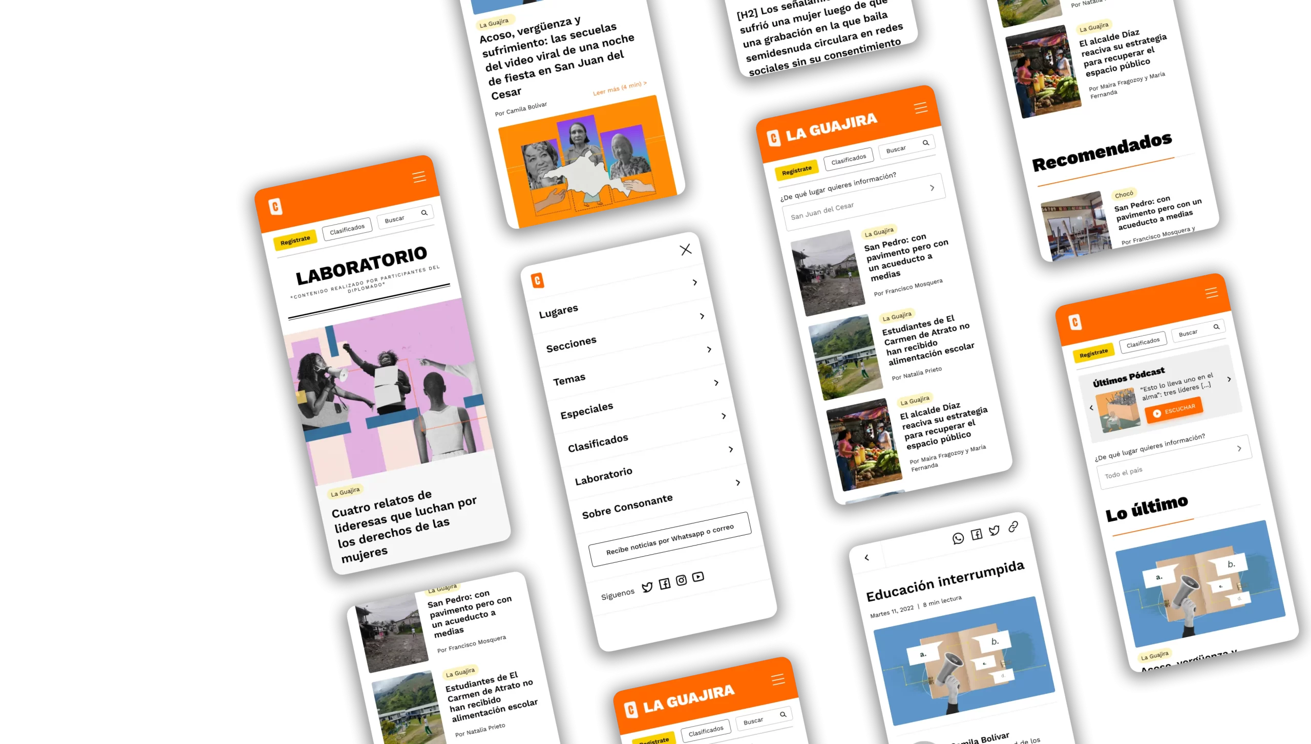
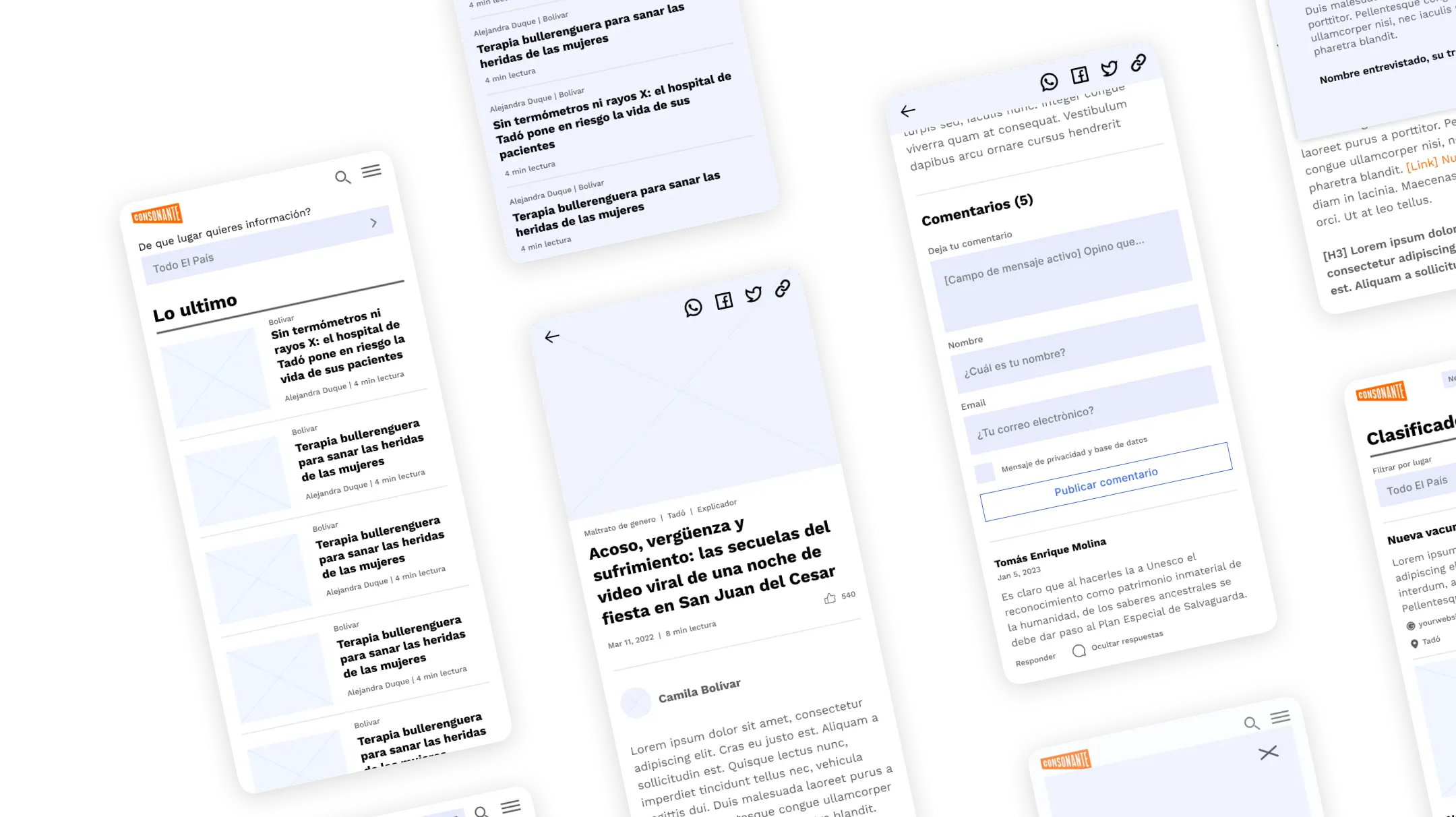
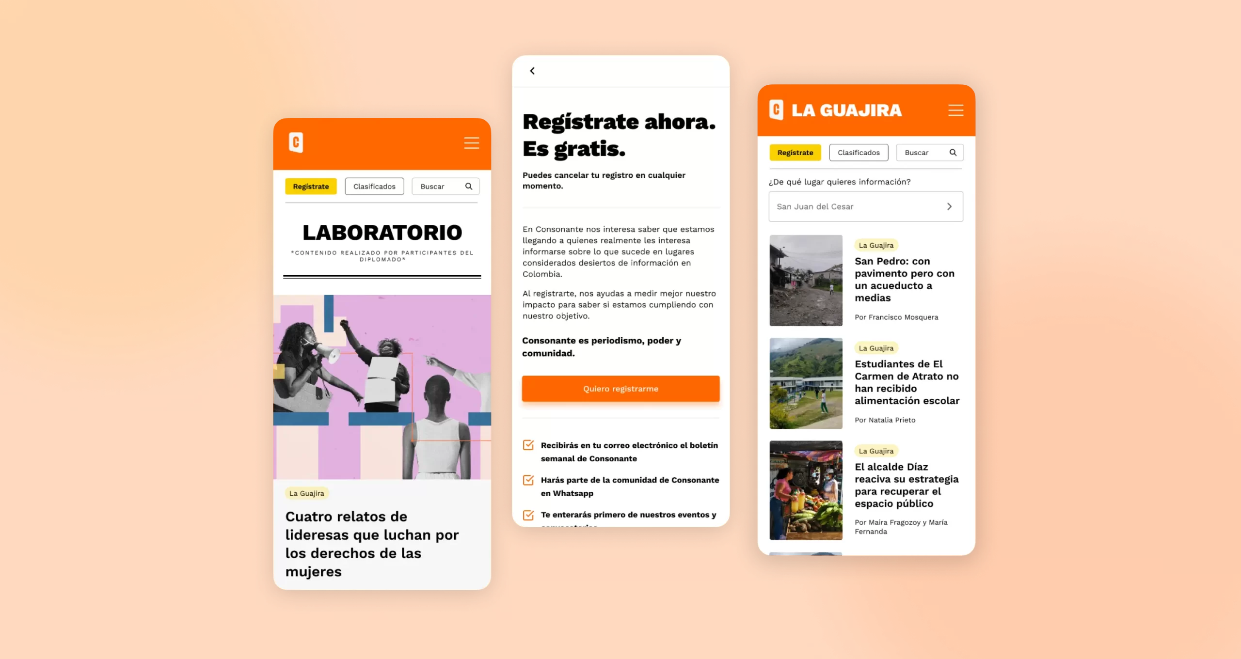
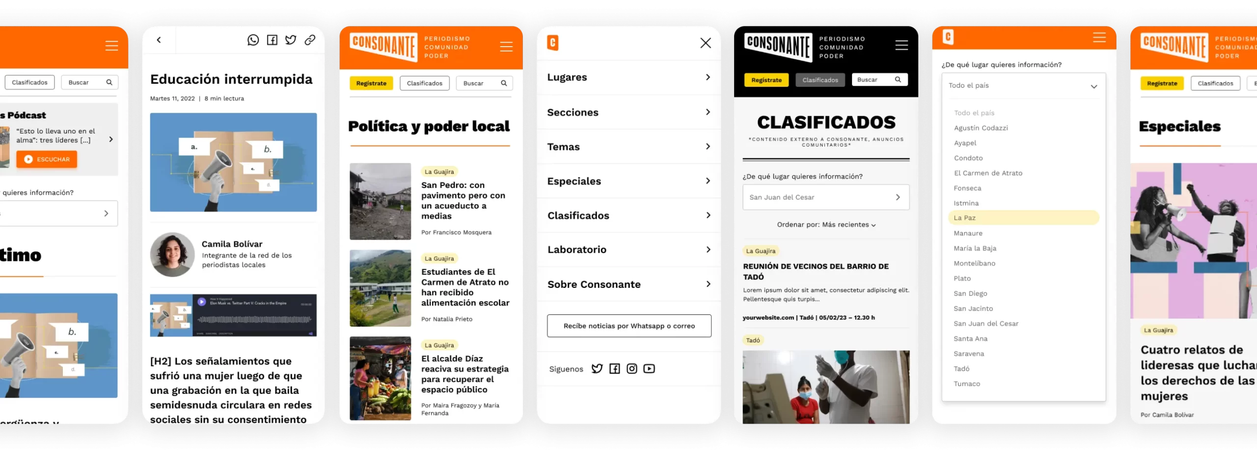
Through information given for the client, specific user requirements have been identified has influenced decisions for its redesign, focusing on changing the Information Architecture, design elements, colour schemes, typography, and aesthetics.

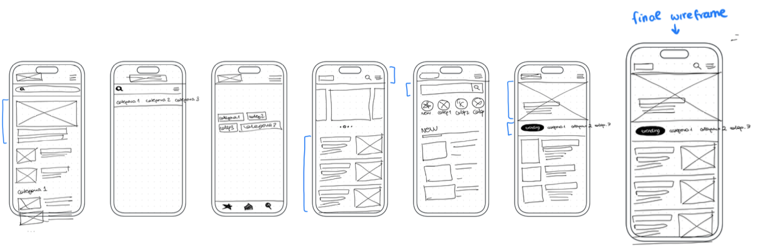
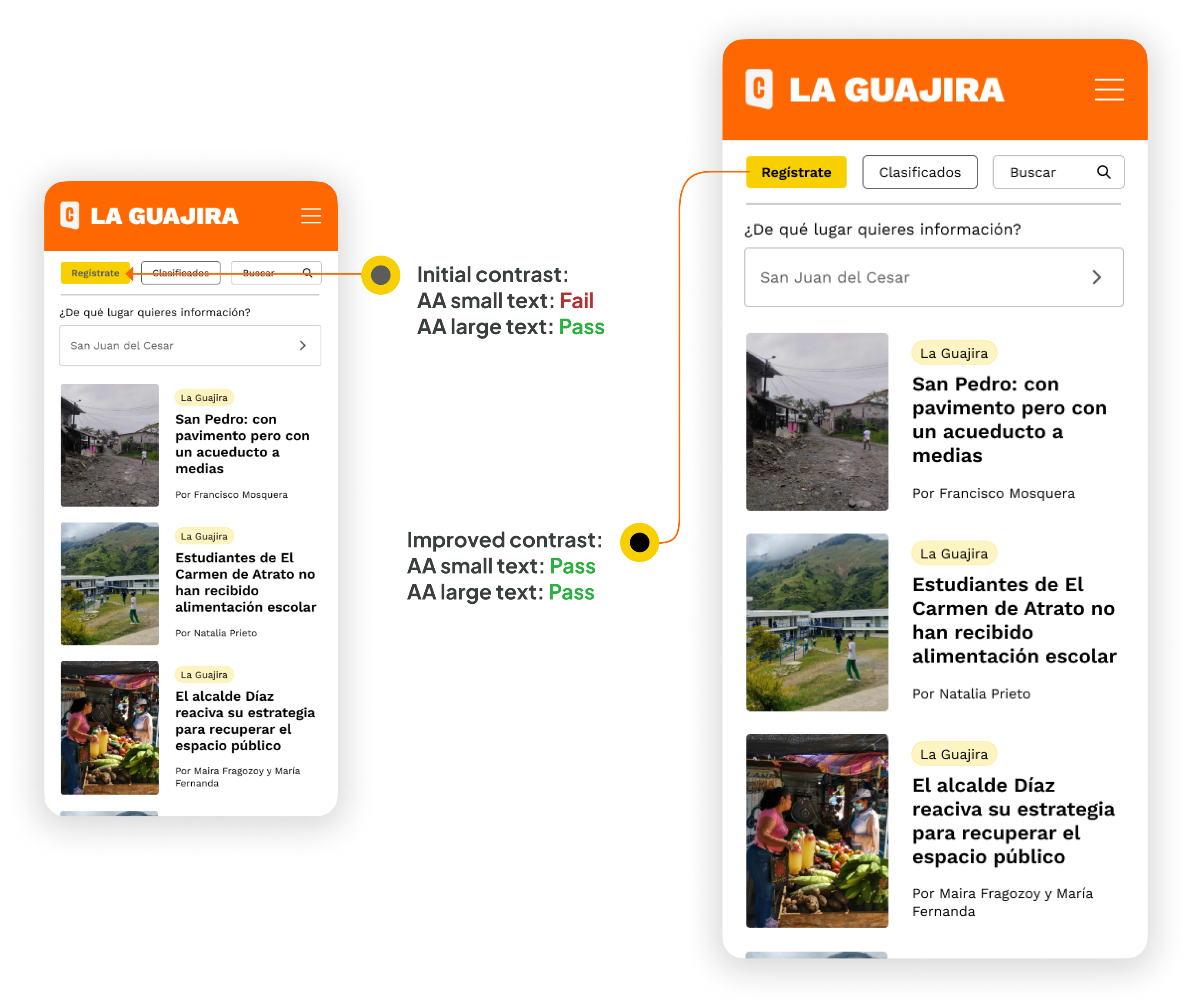
The evaluation of the search feature and performance metrics has uncovered user pain points, guiding improvements in functionality and speed optimisation.

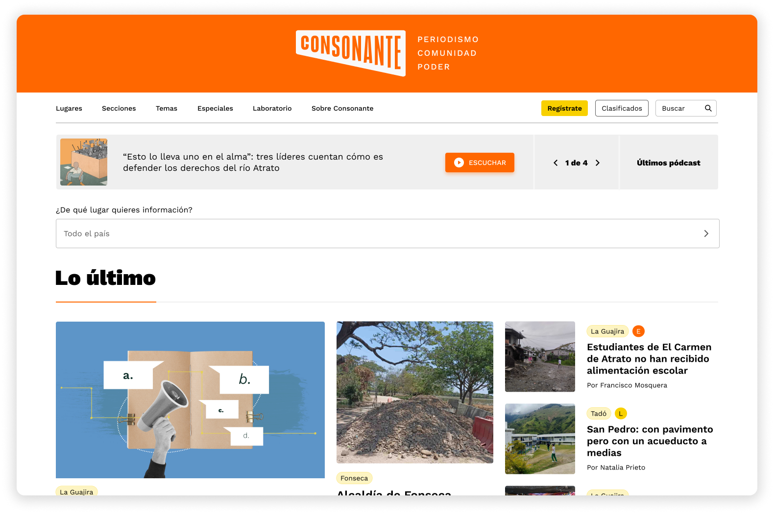
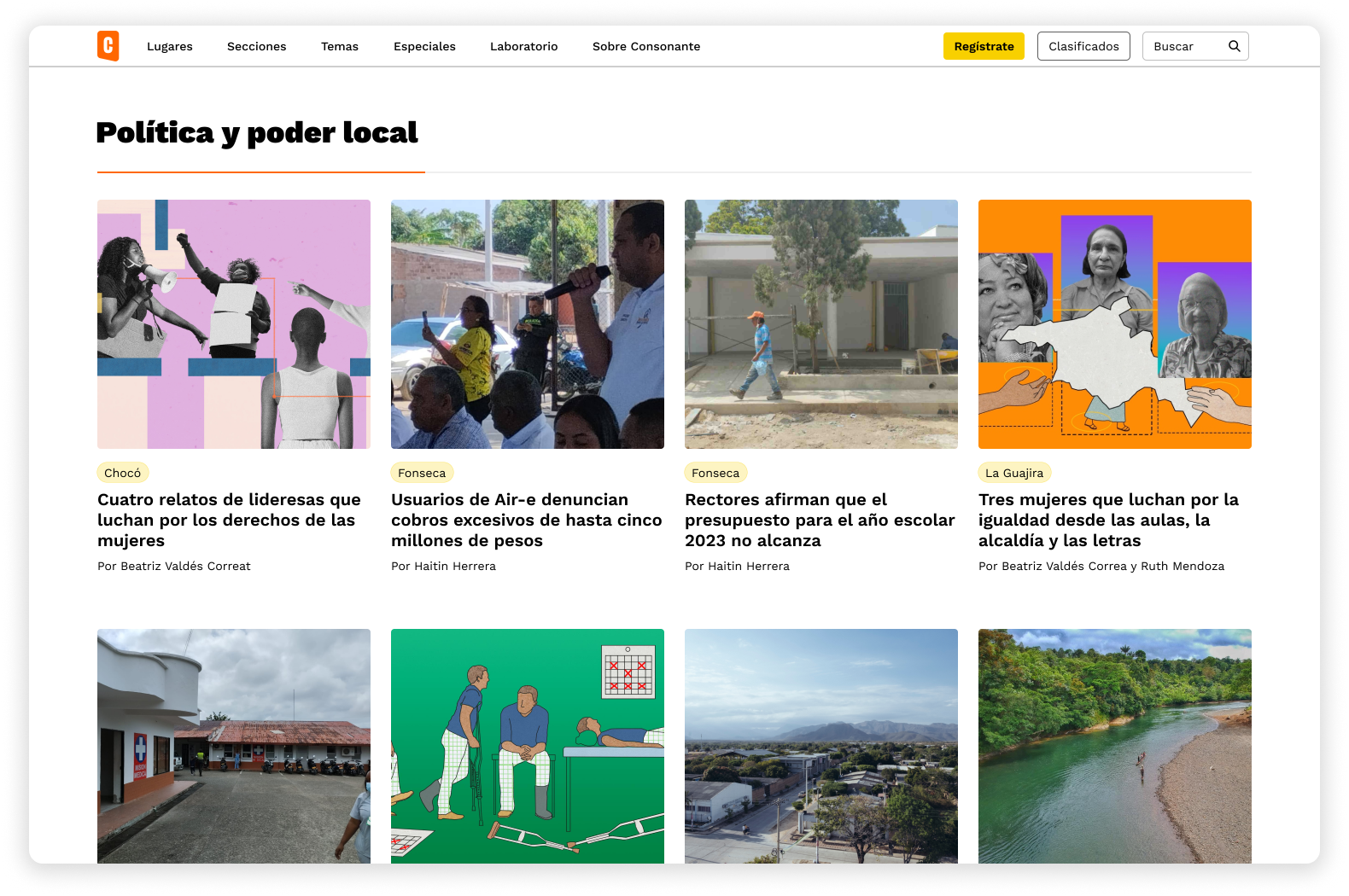
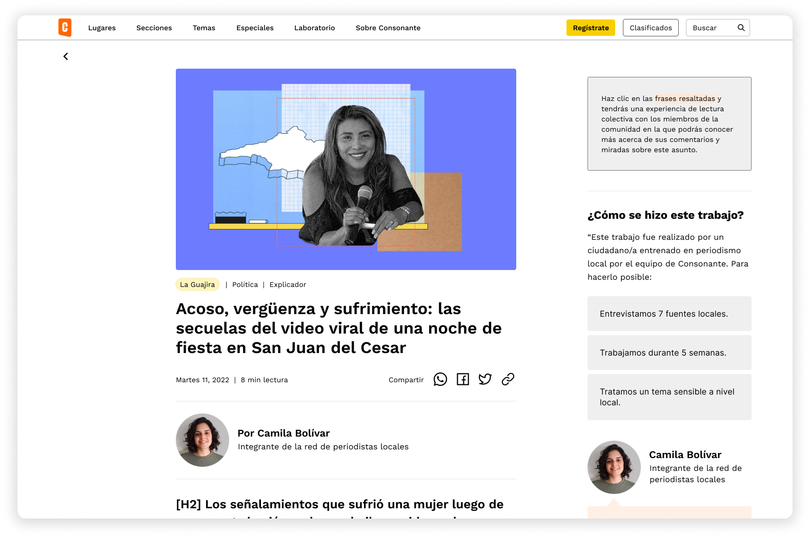
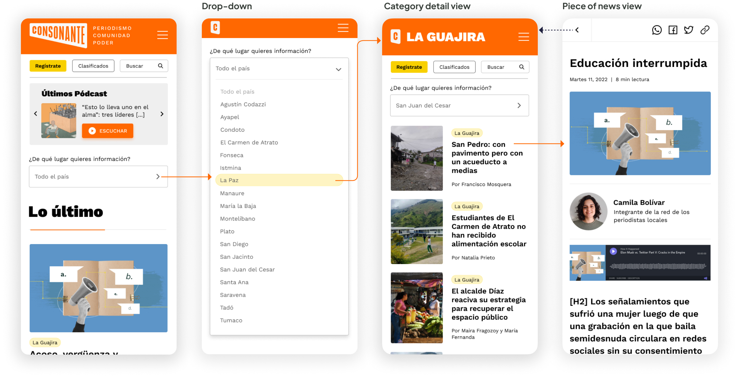
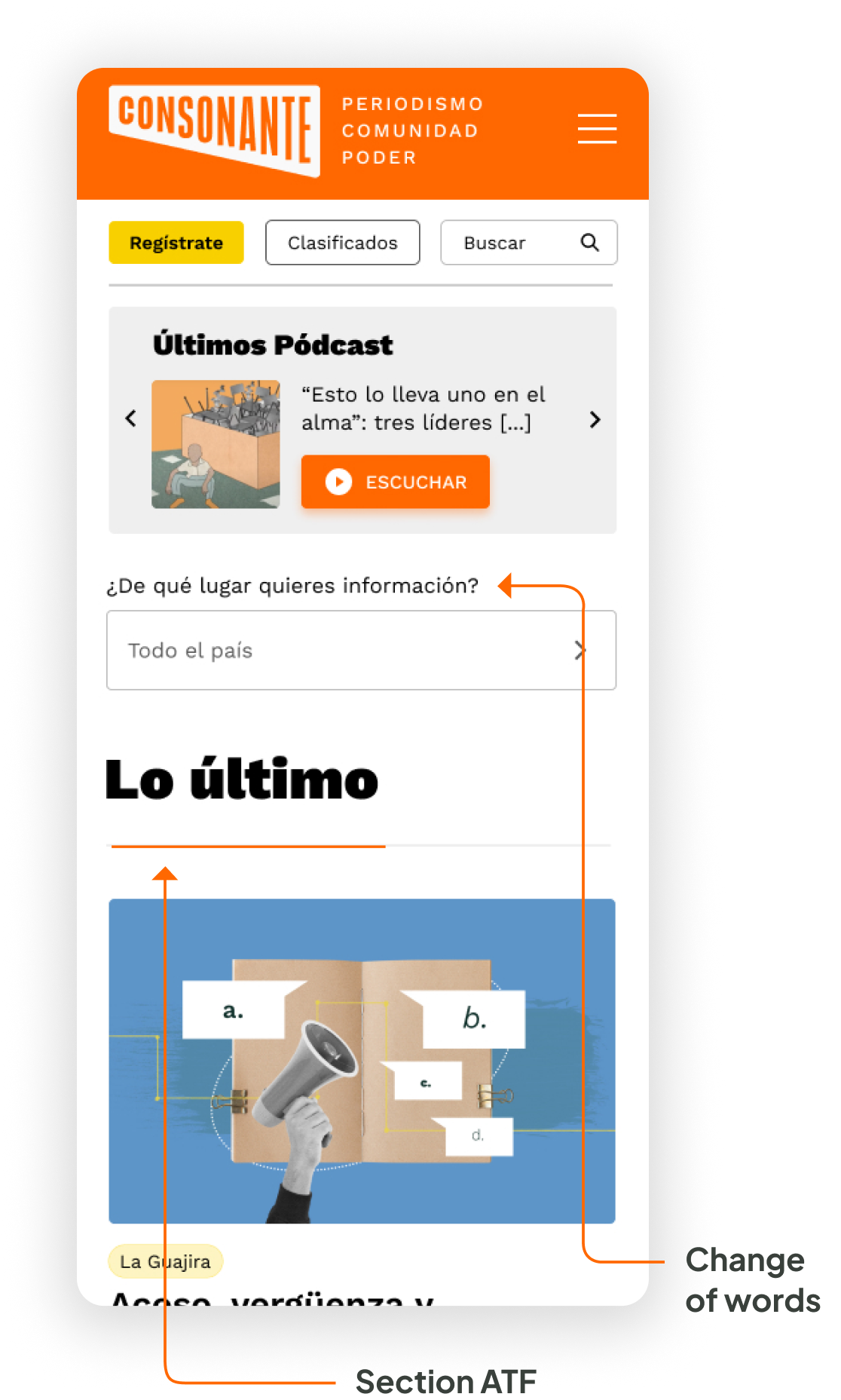
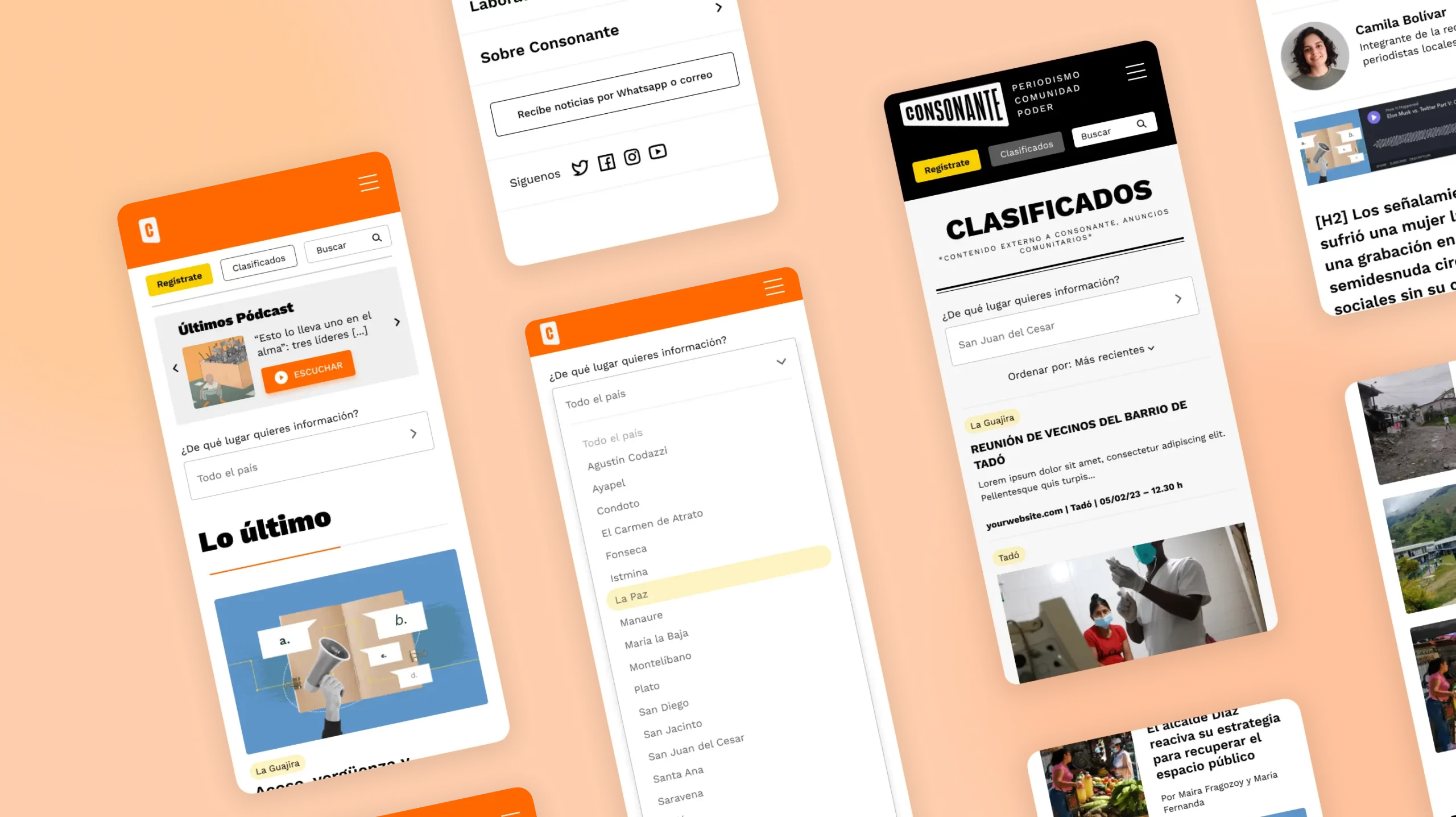
The research has also shed light on functionality preferences, highlighting the importance of easy navigation, content categorisation, and quick access to local news.

In addition, the client wanted to add a CTA for users to sign up for the newsletter, not only via WhatsApp, as it was so far, but to offer its users the possibility to receive news via email.
Pain Points

Functionality

Understanding user preferences for website functionality is crucial to meet their expectations. User research has revealed which features and functionalities are most important to the target audience, such as easy navigation, content categorisation, and quick access to local news.

Graphic identity perception

Through user research, we have assessed the current website's graphic image and its alignment with the audience's perception of a credible media outlet. Feedback on design elements, color schemes, typography, and aesthetics has guided decisions for the website redesign.

Search Feature Evaluation

User interactions and usability testing have helped identify the reasons behind the non-functionality of the search feature on the current website. Feedback has revealed pain points users face when searching for specific news or information, enabling us to make improvements in the redesigned website.

Performance and Speed Optimisation

User satisfaction with the current website's performance score and loading speed was poor. Insights gained from feedback have identified specific issues hindering user experience, facilitating optimisation efforts in the redesign process.

Personas

In every successful User Experience design, understanding the target audience is paramount. Personas provide valuable insights into our users' motivations and challenges, guiding us to create a more tailored and inclusive user experience.

Goals

Stay informed about local news and events.
Access news conveniently despite limited internet connectivity.
Find relevant stories and information that impact her community.
User-friendly website with intuitive navigation and clear content organisation.

Frustrations

Lack of coverage her town receives from larger news outlets.
Limited and intermittent internet connectivity, which hampers her ability to access online news and stay updated regularly.
When news content is not optimised for mobile devices or lacks accessibility features, making it challenging for her to consume news on her preferred platform.

About María

☺️
35
🎓
Bachelor's degree in Education
🏙️
La Guajira
María is a dedicated teacher who is passionate about education and community development. She resides in a town that often goes unnoticed by mainstream news outlets. María strongly believes that access to reliable information is crucial for her town's progress and the well-being of its residents. Her goal is to stay informed about local news, events, and developments that directly impact her community. She wants to be able to access relevant news easily and conveniently, despite the limited coverage her town receives.

Problem statement

María Rodríguez, a teacher in an underserved town, lacks access to reliable and relevant local news due to limited coverage, unreliable sources, and poor internet connectivity.

Mobile-first approach

The mobile-first approach was of paramount importance in this project as it recognised the growing significance of mobile devices in users' lives. By prioritising mobile design and development, we ensured that the website provided an optimal user experience on smaller screens, where a majority of our audience accessed the platform.

Emphasising mobile-first design allowed us to focus on essential content and functionalities, streamlining the user interface and enhancing usability across all devices. This approach not only improved the website's overall performance and load times on mobile but also positively impacted its desktop version.

Additionally, by considering mobile users' needs first, we adopted a user-centric perspective, resulting in a more intuitive and accessible website across various platforms. This approach also led to increased user engagement and satisfaction, ultimately contributing to higher conversion rates and the success of the project.

Paper wireframes

By utilising a low-fidelity medium like paper, we focus on core elements and layout without distraction, allowing us to iterate and refine the design based on user feedback before moving into the digital realm.
These paper wireframes capture key features such as intuitive navigation, content categorisation, search functionality, and mobile optimisation, addressing the specific needs and challenges faced by users in areas with limited coverage and internet connectivity.

Digital wireframes

Bringing the website design to life, seamlessly aligning user needs with intuitive interface. 28 low-fidelity designs and prototype were created.

High-fidelity UI design

Once the initial flow and a first round of the usability study were complete, I started by creating the main screens of the app.

Colour palette

Accent, primary, secondary, tertiary, background

Font

Work Sans: Regular, Medium, Semi-Bold, Bold, Black
AaBbCcDdEeFfGgHh

64 high–fidelity designs were created

Including three different versions to use as detail news for the client to create customised templates as well as five different types of headers depending on what is needed on each page.

Alignment and grid

I picked an 8–point grid for the project and set the margins for within groups at 8 and 16, with margins between groups at 24, 32 and 48.

High-fidelity prototype

I connected my high fidelity designs into a clickable prototype. That will allow me to test the app on the second group of users.

Usability study: findings

I conducted two rounds of usability studies to inform the design process. The initial study guided the transition from wireframes to mockups, while the second study, utilising a high-fidelity prototype, identified areas in the mockups that required further refinement.

I validated my prototype with 3 users. Each were given a subset of the prototype dedicated to the homepage, piece of news detail and register form. I wanted to be sure users could find easily the “Towns” section, and that the register form was clear and usable.

This was tested over a zoom call, where I introduced the user to the website and asked them questions. The questions were dedicated to finding out whether the register and user flow were easy enough to understand.

Study results

66% of users (2 out of 3) were confused about the placement of the latest news on the homepage. They expected to find it ATF instead of the Highlight section.
They also were unsure about the wording used at the “Towns” selector.

Prototype Update concept

66% of users (2 out of 3) were confused about the placement of the latest news on the homepage. They expected to find it ATF instead of the Highlight section.
They also were unsure about the wording used at the “Towns” selector.

Accessibility check

The app has been evaluated for contrast to match the AA standards of WCAG. In some cases I found that the contrast can be improved.

One specific example I would like to share is the newsletter button. My initial idea was to differentiate that button from all the other CTA’s, but the choice of colour provided to not be fully accessible. In the final version the text colour was modified.
Project summary
During the project, I managed to perform a min usability study (online), create a set of low fidelity wireframes, connect them into a prototype and build them out to high-fidelity, beautiful UI designs. In the last checkup round I also did an extensive QA audit focusing on consistency and colour contrast with regards to accessibility.
linkedin facebook pinterest youtube rss twitter instagram facebook-blank rss-blank linkedin-blank pinterest youtube twitter instagram